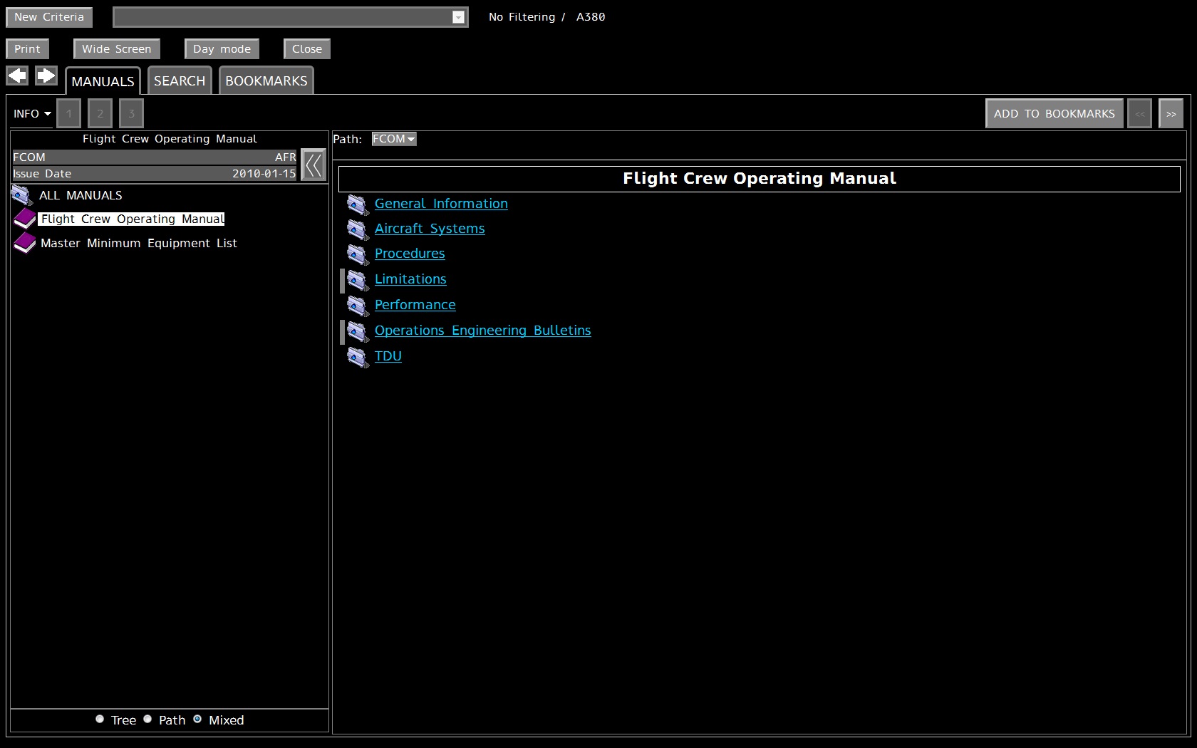
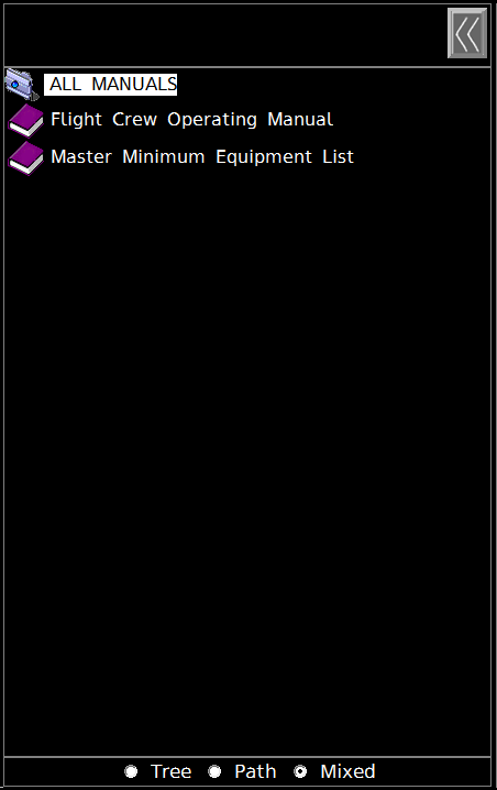
3 Manuals access
The consultation mode enables you to browse all the manuals in the MANUALS tab. In this mode you can navigate through a manual and read all the documents contained in it. Those documents are grouped in folders.
There are as many version of document as there are aircrafts. Nevertheless a version of a document can be applicable to several aircrafts.
The manuals in the tree view are displayed according to the aircraft choice done in the Companies & Effectivity selection page.
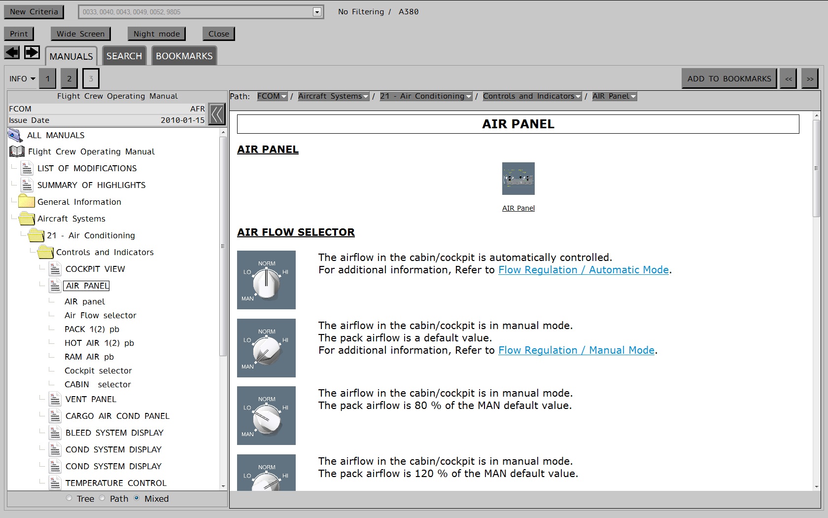
The Consultation panel is split into three main panels:
- The left panel, “Navigation panel”:
This panel displays the documentation structure of manuals using a tree representation
- The middle panel, “Content panel”:
This panel displays a detailed description of the element selected in the tree
- The above panel
displays several toolbars to access information:
- Criteria toolbar
- Control toolbar
- Consultation toolbar
This panel displays the navigation tree.
Figure 34: Navigation tree representation
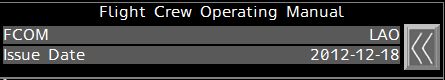
Above the navigation tree a metadata area is displayed.
Figure 35: Metadata area
This metadata area displays information related to the manual currently consulted:
- The manual title
- The manual code
- The Revision date
- The Airline code
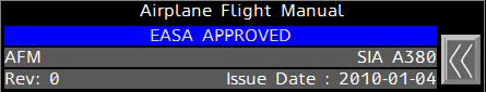
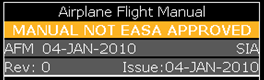
If the manual currently consulted is an Airplane Flight Manual (AFM), the metadata display the manual status. If the manual has a specific status (default value is “EASA APPROVED”), the status is displayed in a specific foreground color and a specific background color (defined in a configuration file).
Figure 36: Metadata area for AFM with a specific status
If not, the status is displayed in a non specific foreground color and a non specific background color (also defined in a configuration file).
Figure 37: Metadata area for AFM with a non specific status
The navigation tree allows visualizing several manuals at the same time.
Figure 38: Multi manual tree visualization
The navigation tree has three different navigation modes:
- Tree: displays a hierarchical view of manuals
- Path: displays a compact view and shows only the parent nodes and brothers of the current selected node.
- Mixed: displays the children, siblings and nodes involved in the current selected node's path. It also always displays the first level nodes of the manual node.
You can trigger the toggle button to choose either mixed, path or tree navigation mode.
Figure 39: Mixed node /Path node /Tree node
The navigation tree displays:
- DU available for the effectivity selected in the Companies & Effectivity selection page.
- DU not having TDU for the effectivity selected in the Companies & Effectivity selection page.
- Linear DU if the user comes from the Manuals tab
- Linear DU available for the effectivity selected in the Companies & Effectivity selection page, if the user comes from the Search tab.
- In no filtering mode, all DU will be displayed, except : if a DU has TDU for all effectivities
- non-linear DU if this DU is included within the result of an ECAM search .
The middle panel is split in three main areas:
- The “Interactive Path”
- The Content (textual representation) of documents
- The Media panel (hidden or displayed)
The topics in the tree view are displayed according to the effectivity selected in the Companies & Effectivity selection page.
In no filtering mode, topic corresponding to the first group for which its item has no TDU is displayed.
The content panel and the media panel shall be displayable simultaneously
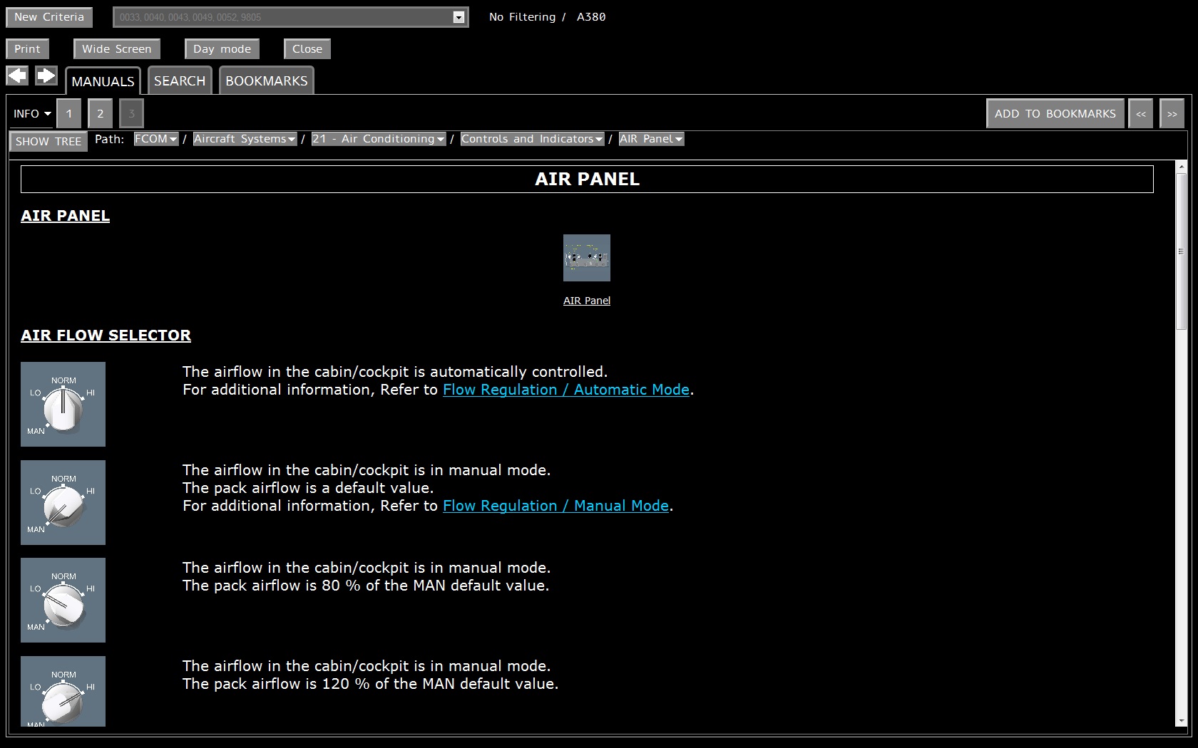
Figure 40: Content panel
An interactive path bar displayed above the content panel shows the reference (path and name) of the currently displayed page.
Each part of the path of the document is a hyperlink
Selecting a part of the path synchronizes the navigation tree on the target element.
When a link is activated in the content of a topic, the Reference Bar also displays a from field giving the source of the link, in the lower part of the first bar.
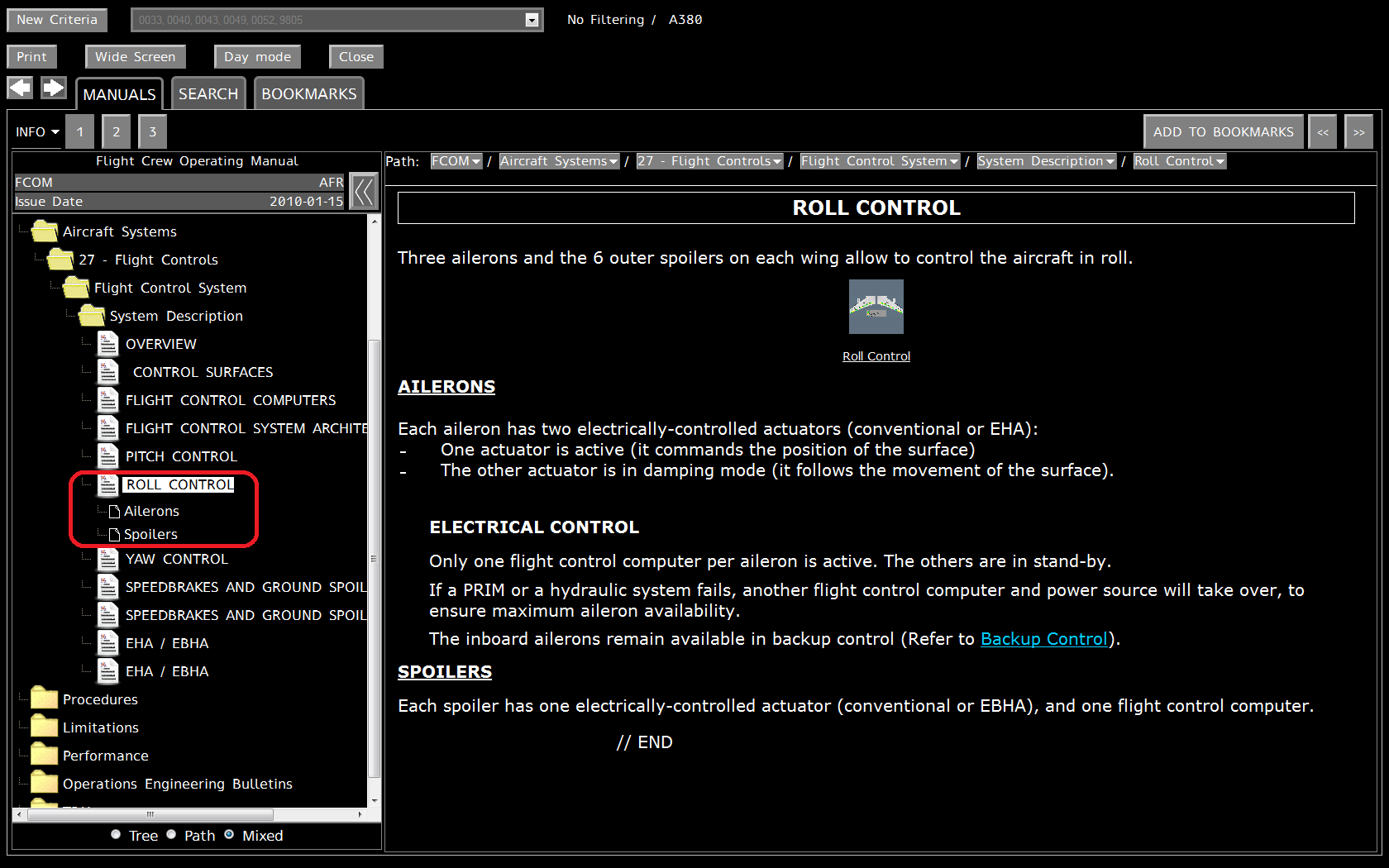
This panel displays the content of the selected page of the manual.
The page might be longer than the screen and so necessitate scrolling in order to be displayed entirely.
A document can contain the following items:
- Thumbnails: those graphics are clickable. If you click on it then the real image is displayed in the media panel
- Multimedia document: they are also displayed as thumbnails. If you click on such a thumbnail, a multimedia player will be automatically launched to consult it. Note that if the player is not available on your computer you will be able to download the file and save it on the disk.
A document may also contain links :
- Abbreviations links : when there is an abbreviation on a DU, users can display abbreviation definition in a popup. Clicking on the popup window shall close it.
Figure 44: Abbreviation popup window
- Links to other DU : users can navigate between DU by clicking on links. Targeted DU or TDU will be displayed in the consultation view.
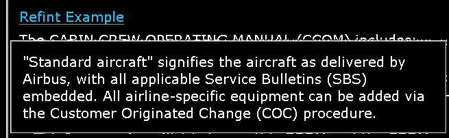
- Refint embedded link : when clicking on a refint embedded link, the target anchor element shall be displayed in a popup window. Clicking on the popup window shall close it.
Figure 45: Refint popup window
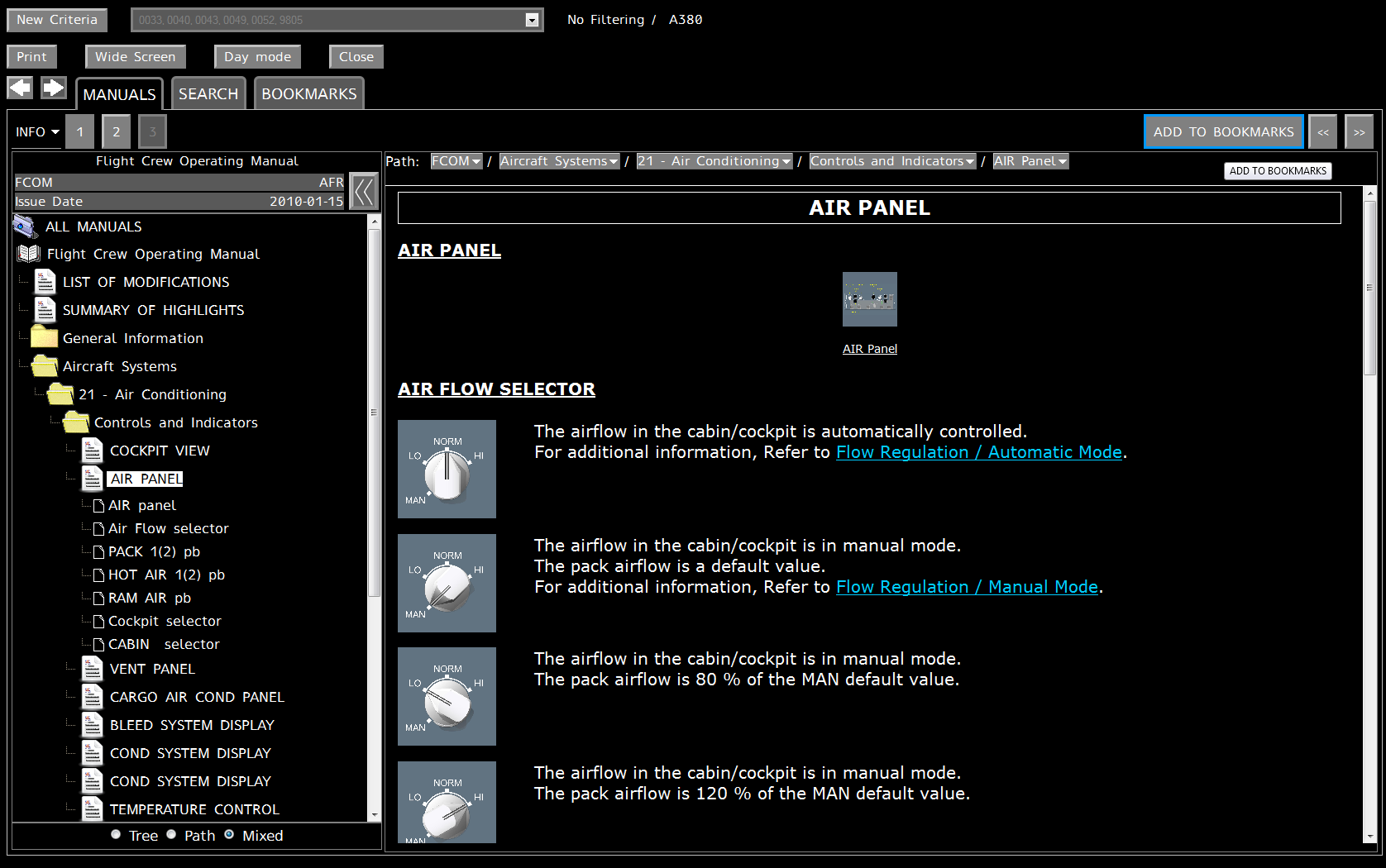
The middle panel is also used to display media document. To show this panel you must consult a document which contain a thumbnail representing a media.
Figure 46: Document Content with thumbnail selected
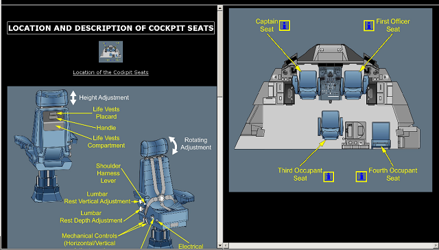
If the thumbnail is clicked, the corresponding graphic is displayed in the Media panel.
Figure 47: Document Content and Media panel, vertical split
The media can be displayed above the document or at its right:
Figure 48: Vertical mode - Horizontal mode
You can right-click on the media and select in the contextual menu one of the following actions:
- Zoom in
- Zoom out
- Reset to the original size
Note that if the graphic is bigger than the media area it will be automatically resized to fit the area.
A media may contain hotspot (drawn in yellow). By clicking on one of those hotspots you may navigate to another document or launch an index search. If the hotspot represents an index search, by clicking on it you will automatically launch this search. The navigation tree will be highlighted according to the results of this search.
6.3 Criteria selection Toolbar
The criteria toolbar enables you to manage the effectivity choice.
Figure 49: Criteria selection toolbar
The
 button in the Criteria
selection toolbar allows you to come back to the Effectivity selection page.
button in the Criteria
selection toolbar allows you to come back to the Effectivity selection page.
The
current effectivity is displayed after the drop down list in the criteria
toolbar:  .
.
This effectivity is used to display the navigation tree. Whenever you click on a document in the navigation tree, its content is displayed according to this effectivity.
.
However if other versions of the document exist for the selected item, then the corresponding effectivity groups are displayed in the list. If you select one of them then the corresponding version of the document will be displayed in the detail panel.
Note that if you select another document in the navigation tree, it will be displayed according to the effectivity chosen in the Companies & Effectivity selection page and not according to the one selected before in the drop down list.
6.3.3 Aircraft type label / MSN or ACN
The label, next to effectivity list, differs according to the Consultation mode selected in the Effectivity selection page.
If
“no filtering”, the label presents the following layout: “no
filtering” / aircraft type (e.g.  ).
).
If
a MSN has been selected, the label presents the following layout: aircraft type
/ MSN (e.g.  ).
).
If
a Registration code has been selected, the label presents the following layout:
aircraft type / ACN (e.g.  ).
).
If
the aircraft has no Registration number, the label presents the following
layout: aircraft type / (MSN) (e.g.  ).
).
6.4 Control Toolbar
The control toolbar provides the following functionalities:
Figure 50: Control toolbar
The
 button enables
you to zoom on the content of the displayed document.
button enables
you to zoom on the content of the displayed document.
If the detail panel displays both document content and media, then the media alone shall be displayed in full-screen:
When
the Zoom function is activated, the button is replaced by the  button.
In
the Consultation mode, pressing the  button restores the previous context in
the History of the application. This means that the back button will bring you
back to the previous state of the application, canceling your last action.
button restores the previous context in
the History of the application. This means that the back button will bring you
back to the previous state of the application, canceling your last action.
In
the Consultation mode, pressing the  restores the next context in the History
of the application. Obviously this button is accessible only if you’ve
pressed on before.
restores the next context in the History
of the application. Obviously this button is accessible only if you’ve
pressed on before.
6.4.5 Set day/night mode function
The
 /
/ buttons enable the user to
switch between night and day modes.
buttons enable the user to
switch between night and day modes.
Figure 53: Consultation view, Day mode
By default, application is set up in night mode.
When
the night mode is activated, the button is displayed allowing to go to
the day mode.
When
the day mode is activated, the button is displayed allowing to go back
to the night mode.
The
 button allows to
print the content of the consultation panel.
button allows to
print the content of the consultation panel.
6.4.7 Close function
The
 button enables
the user to close the consultation view and reverts back to the effectivity selection
page.
button enables
the user to close the consultation view and reverts back to the effectivity selection
page.
The Consultation Toolbar is accessible only in consultation mode.
Figure 54: Consultation toolbar
When consulting military aircraft documentation, the Consultation Toolbar is as follows, with Operating Standards buttons, provided that the OS button has been activated in the configuration file:
The
Operating Standard buttons are the following :  .
.
The functionalities of the toolbar are detailed within the next paragraphs.
The functionalities not accessible for a specific context are disabled in toolbar.
Several shortcuts are available to trigger directly to those functionality.
The
functionalities activated appear surrounded with a specific color. 
The “Show/Hide” tree enables you to show or hide the manuals tree representation.
If
the navigation tree is displayed, a click on  will hide it. As a consequence the
document (and its media) will be displayed in full-screen mode.
will hide it. As a consequence the
document (and its media) will be displayed in full-screen mode.
Figure 55: The navigation tree hidden & “SHOW TREE” consultation button
To
display the navigation tree again, you just have to click on the  button.
Figure 56: The navigation tree & “HIDE TREE” consultation button
By default the navigation tree is displayed.
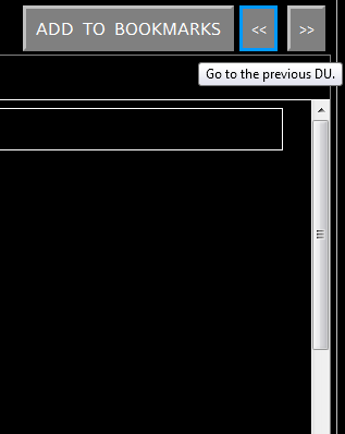
Click
on  “previous”
button displays the document located before the current one in the navigation
tree.
“previous”
button displays the document located before the current one in the navigation
tree.
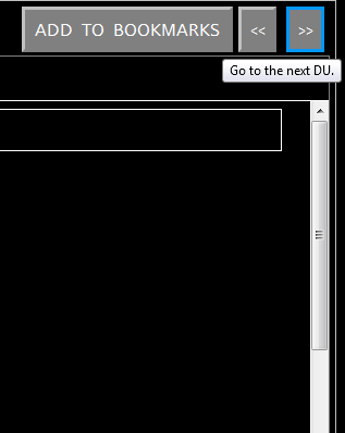
Click
on  “next”
button displays the document located after the actual one.
“next”
button displays the document located after the actual one.
Figure 57: Next action, Current Document / Previous Document
The Sub-topics feature provides the list of second level titles. The second level titles are extracted from the content of the displayed topic (= document = DU).
Figure 58: Sub-topic selection
If you select a “Sub-topic” in the list, then the content panel is automatically scrolled in order to display the part of the document corresponding to this sub-topic.
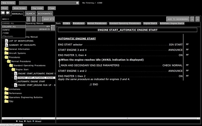
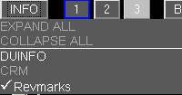
The “DU info” button displays additional metadata concerning the DU.
The DU Info sections displays the id of the document, its revision date and the list of aircraft to which it is applicable.
The DU Info list of aircraft is displayed according to the parameter value set in ihmconfig.properties. By default, value is “msnByRange”.
If no du-info is selected, a click on “INFO” button must be done to close the info list”.
This function allows selecting the layer that will be displayed in the content panel.
In fact a document can be visualized according to several level of complexity. Indeed each layer adds some information on the topic. Though this function you can choose to display or not those additional data.
The selected Layer remains selected through the consultation of several documents. In fact, when the selected layer is not available for a consulted DU, the page is displayed using the highest available layer. Nevertheless the associated button stays selected, but is disabled.
Figure 61: Layer 1 selection, Only one layer enabled
The default layer is 1.
The
buttons  ,
,  and
and  allow you switching to the
layers 1, 2 or 3.
allow you switching to the
layers 1, 2 or 3.
When consulting from a Search access mode and if there is layer 2 data, default layer is 2.
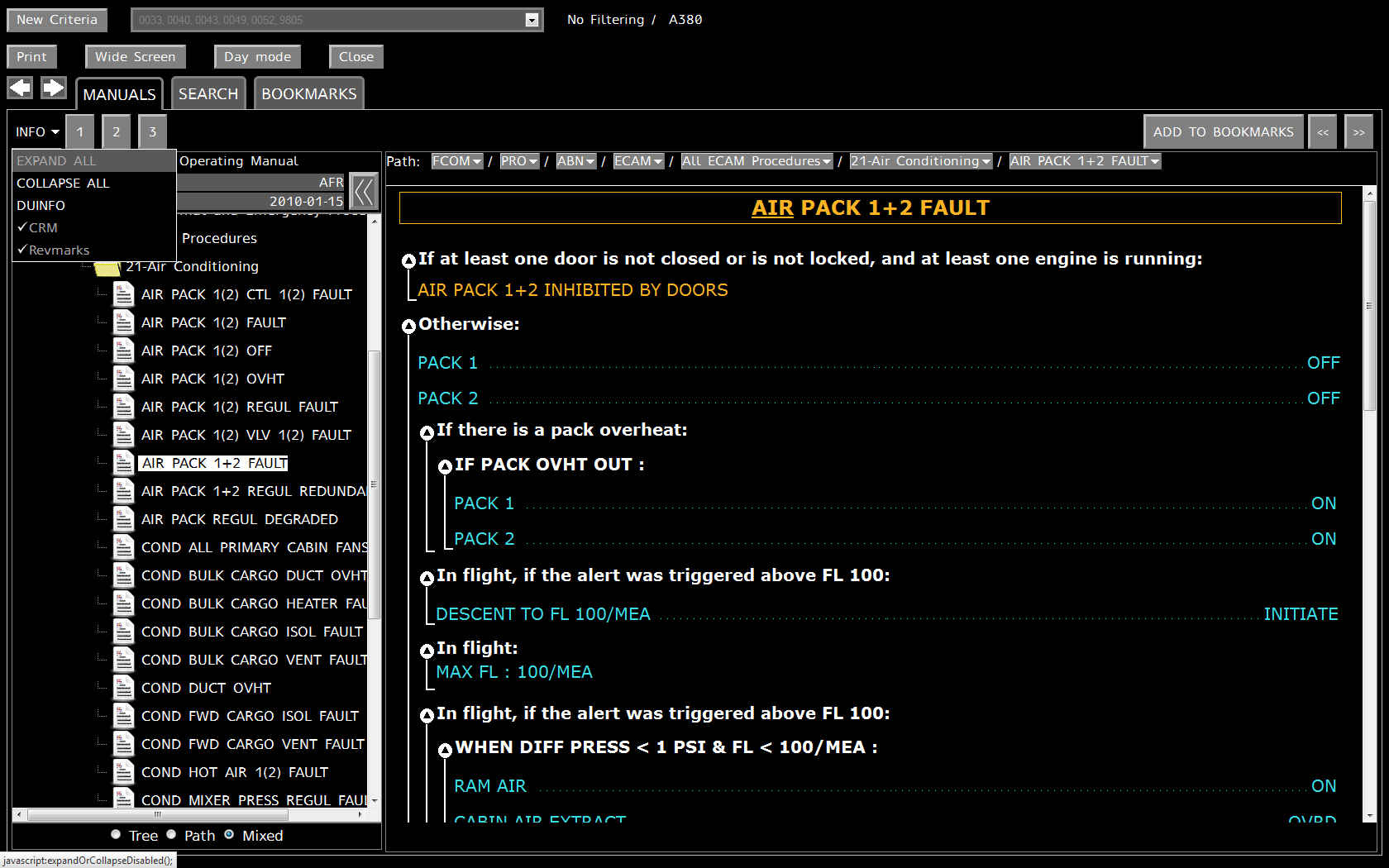
A
document may contain expandable paragraphs. A click on the  button will display the
content of the paragraph.
button will display the
content of the paragraph.
Figure 64: Expandable paragraphs
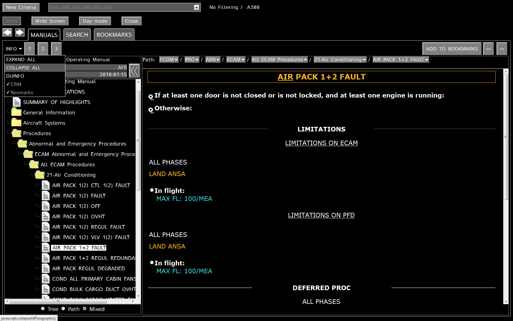
Click
on the "Expand all" button located in Info menu in order to expand
all expendable paragraphs in the displayed DU: 
Figure 65: Collapsible paragraphs
The
paragraph is expanded. The “Collapse All” button becomes available
to collapse all expanded paragraphs in the displayed DU. This button is also
located in the Info menu: 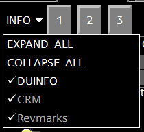
If
a paragraph is expanded, it can be collapsed through an action on the  button located near
the title of the paragraph.
button located near
the title of the paragraph.
On
layer switch, expandable paragraphs (annunciation and condition) shall keep
their previous status (expanded / collapsed ).
A document may contain CRM actions, that are displayed in the right column of a table.
Figure 66: CRM actions displayed
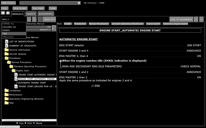
These actions can be displayed or hidden through the “CRM” button in the “Info” menu.
If the CRM flag is deactivated, then the CRM actions disappear (see below).
A document may contain revision marks that show revised elements.
Revmarks are displayed as grey vertical bars in the left DU margin.
If you click on a revision mark of a displayed DU, a pop-up is displayed containing comments in yellow.
The pop-up can be empty if it contains no information. To close the pop-up, click on it.
These revision marks can be displayed or hidden through the “Revmarks” button in the “Info” menu.
A
click on the  button
displays 2 sub-menus “ADD TO LIST” and “ORGANIZE” and
the list of already bookmarked documents.
button
displays 2 sub-menus “ADD TO LIST” and “ORGANIZE” and
the list of already bookmarked documents.
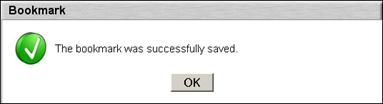
The “ADD TO LIST” allows you to bookmark the selected element and to add it to your “bookmark list”.
An information dialog box is displayed.
Figure 72: Bookmark successful dialog
The user cannot bookmark twice the same DU nor the same folder.
The user Bookmarks are stored and will be available during the next session.
What-if feature presents a list of related subjects’ to a part of the displayed document.
A what-if is often a link to another DU. If user selects a proposed DU, the linked DU will be displayed in the consultation view.
This paragraph concerns only MMEL and CDL manuals. “ECAM List” feature presents a list of ECAM Alerts associated to a DU of MMEL or CDL manuals.
Figure 76: Associated Ecam list
If an “Associated ECAM” in the list is selected the DU corresponding to this ECAM is displayed in consultation view and the DU is selected in the tree.
Figure 77: Associated Ecam selected
The search button allow the user to quickly access to the Search page.
This functionality is available only for consulting military aircraft documentation. It can be deactivated and not available.
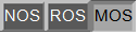
When this functionality is activated, the Operating Standards (OS) buttons allow the user to filter information of displayed DU according to:
-
Normal
Operating Standards (NOS): 
-
Restricted
Operating Standards (ROS): 
-
Military
Operating Standards (MOS): 
The default OS is NOS.
For each OS button:
- The text in the button of the associated OS is grey when the OS is not available for the DU(GDU) that is displayed.
- The text in the button of the associated OS is white when the OS is available for the DU(GDU) that is displayed.
For the two OS that are not selected, the OS buttons are displayed with a dark grey background.
If NOS is selected, the NOS button appears activated, with a light grey background and NOS is displayed in white.
Figure 78: Operating standards buttons set, NOS Selected
If ROS is selected, the ROS button appears activated, with a black background and ROS is displayed in amber.
Figure 79: Operating standards buttons set, ROS Selected
If MOS is selected, the MOS button appears activated, with an amber background and MOS is displayed in black.
Figure 80: Operating standards buttons set, MOS Selected
Selected OS remains selected through a consultation of several DU.
If the selected OS is not available in the new DU, Ops Library Browser Web keeps the associated OS button activated, but with a light grey background and text in dark grey.
Figure 81: MOS Selected but not available in the new displayed DU
When
user selects a DU in a MEL Item, the DU displayed in the content panel may
contain  picture(s).
A click on “m” picture allows opening the maintenance task associated. If you hover the mouse on the “m” picture, the task reference is displayed.
Figure 82: Maintenance task link, link to Airnav
Once the maintenance task associated is opened, Ops Library Browser Web calls Airnav in Internet Explorer through an URL containing this task reference.
Go to the index page.


